This post is very old and contains obsolete information.

There are a couple of good material design libraries out there, and I’m going to build a basic site with create-react-app to test out how to really make them work. Material design released a new version of their web components, and we’re going to look at a few React libraries that will help us use them.

Material Components For Web

These components were written in SASS and JS. There are various ways to customize them and build your design. We’re going to look at rmwc today and show what it’s like to use it.

jamesmfriedman/rmwc - A React wrapper for Material Design (Web) Components

As it says in the description, this is a thin wrapper on top of Google’s work, which is nice to keep things in place and in sync.

The basic idea

Google’s framework itself works by extensive CSS classes that you put onto your HTML elements. Overall themes can be customized using CSS variables to change, for example, the theme colors. You can also get into the SCSS itself to change how things are generated. This is how most of the demonstration pages of the components are customized.

Basically though, we are going to bring in the material css, add the correct css classes to style our components, and use regular css to help lay things out. If we want to go crazy we can start using the scss directly.

The rmwc library basically bridges the gap between the DOM tweaking stuff that React and the Material design library does.

Create the app

  1. create-react-app rmwc-test
  2. cd rmwc-test
  3. yarn add rmwc webfontloader react-helmet

Inside of src/index.js lets make sure that we include css that’s included from the npm package material-components-web. Also, lets pull in some fonts from Google, both Roboto as well as the Material Design Icons.

 1
 2
 3
 4
 5
 6
 7
 8
 9
10
11
12
13
14
15
16
import React from "react";
import ReactDOM from "react-dom";
import "./index.css";
import App from "./App";
import registerServiceWorker from "./registerServiceWorker";
import "material-components-web/dist/material-components-web.css";
import WebFont from "webfontloader";

WebFont.load({
  google: {
    families: ["Roboto:300,500,700", "Material Icons"],
  },
});

ReactDOM.render(<App />, document.getElementById("root"));
registerServiceWorker();

Add some components

Lets add a quick Toolbar on the top of the page, putting this file in src/navbar.js. A few things to note here:

  1. Everything is exported from rmwc directly, its clear where to import from. (This is a preview of material-ui which I’ll cover later.)
  2. We’re using the Material UI Icon fonts, and this is done using ligatures. What this means is that we pass in the name of the icon (“menu”, “print”, and “account_circle”) that will be rendered as text until the font is loaded. At that point, the text will be replaced as an icon, so it’s a nice experience.
 1
 2
 3
 4
 5
 6
 7
 8
 9
10
11
12
13
14
15
16
17
18
19
20
21
22
23
24
25
26
27
import React, { Component } from "react";
import {
  Toolbar,
  ToolbarRow,
  ToolbarSection,
  ToolbarMenuIcon,
  ToolbarTitle,
  ToolbarIcon,
} from "rmwc";

export default class Navbar extends Component {
  render() {
    return (
      <Toolbar>
        <ToolbarRow>
          <ToolbarSection alignStart>
            <ToolbarMenuIcon use="menu" onClick={this.props.toggle} />
            <ToolbarTitle>RMWC Test Code</ToolbarTitle>
          </ToolbarSection>
          <ToolbarSection alignEnd>
            <ToolbarIcon use="account_circle" onClick={this.props.login} />
          </ToolbarSection>
        </ToolbarRow>
      </Toolbar>
    );
  }
}

Now lets throw in a quick login.js which shows an example of how to pop up a dialog, put a form it in with a couple of text fields. Couple of notes here:

  1. handleChange is a function that returns a function that, when called as part of an onChange handler updates a specific attribute of the state. Crazy what JavaScript can do, and I’m not sure if that’s an argument for it or not.
  2. I was having trouble using all of the Dialogcomponents to make a custom Dialog as specified in the docs so I’m doing this body trick of passing in a function. This seems like a bug.
 1
 2
 3
 4
 5
 6
 7
 8
 9
10
11
12
13
14
15
16
17
18
19
20
21
22
23
24
25
26
27
28
29
30
31
32
33
34
35
36
37
38
39
40
41
42
43
import React, { Component } from "react";
import { TextField, Dialog } from "rmwc";

class Login extends Component {
  state = { email: "", password: "" };
  handleChange = (val) => (evt) => {
    this.setState({ ...this.state, [val]: evt.target.value });
  };

  loginForm = () => {
    return (
      <div>
        <TextField
          label="email"
          fullwidth
          onChange={this.handleChange("email")}
        />
        <TextField
          label="Password"
          type="password"
          fullwidth
          onChange={this.handleChange("password")}
        />
      </div>
    );
  };

  render() {
    return (
      <Dialog
        open={this.props.opened}
        onClose={this.props.toggle}
        title={"Login please!"}
        onAccept={() => {
          console.log(this.state);
        }}
        body={this.loginForm()}
      />
    );
  }
}

export default Login;

Let’s also create a drawer.js file that we can use as a sliding nav menu. This is ripped directly from the docs and doesn’t do anything, but it’s fun to have in there.

 1
 2
 3
 4
 5
 6
 7
 8
 9
10
11
12
13
14
15
16
17
18
19
20
21
22
23
24
25
26
27
28
29
30
31
import React, { Component } from "react";
import {
  PersistentDrawer,
  PersistentDrawerHeader,
  PersistentDrawerContent,
  ListItem,
  ListItemText,
} from "rmwc";

export default class Drawer extends Component {
  render() {
    return (
      <PersistentDrawer open={this.props.opened}>
        <PersistentDrawerHeader style={{ backgroundColor: "#f6f6f6" }}>
          PersistentDrawerHeader
        </PersistentDrawerHeader>
        <PersistentDrawerContent>
          <ListItem>
            <ListItemText>Cookies</ListItemText>
          </ListItem>
          <ListItem>
            <ListItemText>Pizza</ListItemText>
          </ListItem>
          <ListItem>
            <ListItemText>Icecream</ListItemText>
          </ListItem>
        </PersistentDrawerContent>
      </PersistentDrawer>
    );
  }
}

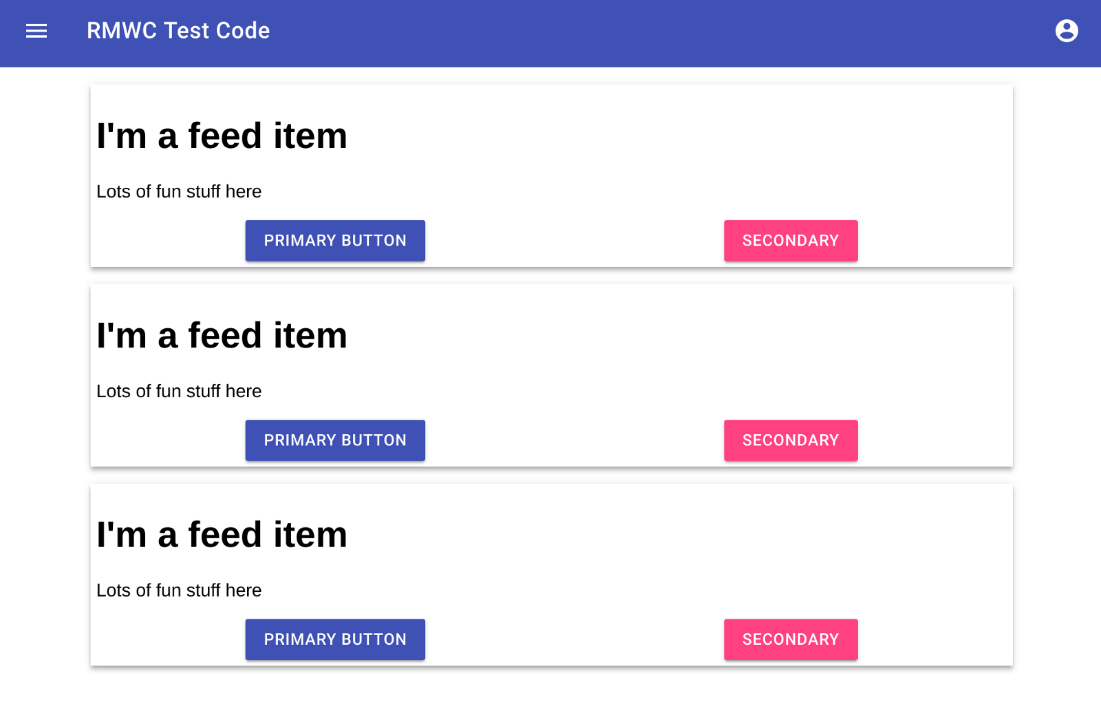
Lets build out a basic feed page feed.js so we can get some stuff on the screen.

 1
 2
 3
 4
 5
 6
 7
 8
 9
10
11
12
13
14
15
16
17
18
19
20
21
22
23
24
25
26
27
28
29
30
31
32
33
34
35
36
37
38
39
40
import React, { Component } from "react";
import { Button, Elevation } from "rmwc";

class FeedItem extends Component {
  state = { height: 4 };

  render() {
    return (
      <Elevation
        z={this.state.height}
        transition
        onMouseOver={() => this.setState({ height: 10 })}
        onMouseOut={() => this.setState({ height: 4 })}
      >
        <h1>Im a feed item</h1>
        <p>Lots of fun stuff here</p>
        <div className="button_list">
          <Button raised>Primary Button</Button>
          <Button raised theme={["secondary-bg", "text-primary-on-secondary"]}>
            Secondary
          </Button>
        </div>
      </Elevation>
    );
  }
}

class Feed extends Component {
  render() {
    return (
      <div className="feed">
        <FeedItem />
        <FeedItem />
        <FeedItem />
      </div>
    );
  }
}

export default Feed;

Now we can tie it all together with an updated App.js. Here we are tying our components together

 1
 2
 3
 4
 5
 6
 7
 8
 9
10
11
12
13
14
15
16
17
18
19
20
21
22
23
24
25
26
27
28
29
30
31
import React, { Component } from "react";
import Navbar from "./navbar";
import Drawer from "./drawer";
import Login from "./login";
import Grid from "./grid";

class App extends Component {
  state = { drawer: false, login: false };

  drawerToggle = () => {
    this.setState({ ...this.state, drawer: !this.state.drawer });
  };
  loginToggle = () => {
    this.setState({ ...this.state, login: !this.state.login });
  };

  render() {
    return (
      <div className="app">
        <Login opened={this.state.login} toggle={this.loginToggle} />
        <Drawer opened={this.state.drawer} />
        <div className="body">
          <Navbar toggle={this.drawerToggle} login={this.loginToggle} />
          <Grid />
        </div>
      </div>
    );
  }
}

export default App;

And finally, lets get some basic index.css in place so that the Drawer doesn’t take up any vertical space when closed. (Also, I’m sure I could be using flex box better, but I’m learning as I go.)

 1
 2
 3
 4
 5
 6
 7
 8
 9
10
11
12
13
14
15
16
17
18
19
20
21
22
23
24
25
26
27
28
29
30
31
32
33
34
35
36
37
38
39
body {
  margin: 0;
  padding: 0;
  font-family: sans-serif;
}

.app {
  display: flex;
  flex-direction: row;
  box-sizing: border-box;
}

.body {
  display: flex;
  flex-direction: column;
  flex-grow: 1;
  height: 100%;
  box-sizing: border-box;
}

.feed {
  width: 100%;
  display: flex;
  flex-direction: column;
  align-items: center;
}

.feed > div {
  margin-top: 15px;
  width: 100%;
  padding: 5px;
  max-width: 800px;
}

.button_list {
  display: flex;
  align-items: center;
  justify-content: space-around;
}

That’s a lot of boiler plate to get through! But we have the basics of something simple, so lets start playing around with what can be done. This is what you should see:

CSS Custom Properties

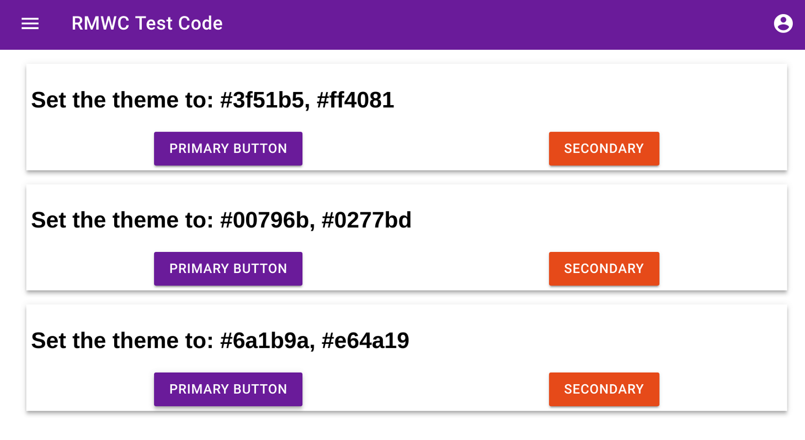
One simple way to change the colors and look and feed of things is to use CSS Custom Properties. Basically, we’ll inject some specific CSS rules and it will change the primary, accent, and other colors of the site. These variables are documented in the material design site, and this method means that we’ll need to set each one individually, the light and dark variants aren’t calculated.

Lets change our feed item to use react-helmet to set some styles dynamically. I’m going to pass in the primary and secondary color options to each feed item, and when you click a button there, it passes it up to the main feed component to inject it into the head element using react-helmet. I picked the colors using the material design color picker, which is a fun tool that helps you understand the theming options.

 1
 2
 3
 4
 5
 6
 7
 8
 9
10
11
12
13
14
15
16
17
18
19
20
21
22
23
24
25
26
27
28
29
30
31
32
33
34
35
36
37
38
39
40
41
42
43
44
45
46
47
48
49
50
51
52
53
54
55
56
57
58
59
60
61
62
63
64
65
import React, { Component } from "react";
import { Button, Elevation } from "rmwc";
import Helmet from "react-helmet";

class FeedItem extends Component {
  state = { height: 4 };

  click = () => {
    this.props.theme(this.props.primary, this.props.secondary);
  };

  render() {
    return (
      <Elevation
        z={this.state.height}
        transition
        onMouseOver={() => this.setState({ height: 10 })}
        onMouseOut={() => this.setState({ height: 4 })}
      >
        <h2>
          Set the theme to: {this.props.primary}, {this.props.secondary}
        </h2>
        <div className="button_list">
          <Button raised onClick={this.click}>
            Primary Button
          </Button>
          <Button
            raised
            onClick={this.click}
            theme={["secondary-bg", "text-primary-on-secondary"]}
          >
            Secondary
          </Button>
        </div>
      </Elevation>
    );
  }
}

class Feed extends Component {
  state = { primary: "#3f51b5", secondary: "#ff4081" };
  setTheme = (primary, secondary) => {
    this.setState({ primary, secondary });
  };
  render() {
    return (
      <div className="feed">
        <Helmet>
          <style>
            {":root { --mdc-theme-primary: " +
              this.state.primary +
              "; --mdc-theme-secondary: " +
              this.state.secondary +
              ";}"}
          </style>
        </Helmet>
        <FeedItem primary="#3f51b5" secondary="#ff4081" theme={this.setTheme} />
        <FeedItem primary="#00796b" secondary="#0277bd" theme={this.setTheme} />
        <FeedItem primary="#6a1b9a" secondary="#e64a19" theme={this.setTheme} />
      </div>
    );
  }
}

export default Feed;

And here’s an example of what that looks like:

So with the basic setup, you have access to the CSS file that comes pre-generated with the material-components-web package, CSS variables that help set overall colors and theming options, and you’re own CSS file that you can use to do layout and specific design tweaks. What if that’s not enough?

Using SASS

(If you are running on a Chromebook, follow the instructions here to get node-sass to install correctly.) Otherwise we start with the instructions from the create-react-app README.md file.

First we add node-sass and a utility package to our environment

yarn add node-sass-chokidar node-run-app

Then in package.json we change the scripts around to watch and process our scss files.

 1
 2
 3
 4
 5
 6
 7
 8
 9
10
"scripts": {
    "build-css": "node-sass-chokidar --include-path ./src --include-path ./node_modules src/ -o src/",
    "watch-css": "npm run build-css && node-sass-chokidar --include-path ./src --include-path ./node_modules src/ -o src/ --watch --recursive",
    "start-js": "react-scripts start",
    "start": "npm-run-all -p watch-css start-js",
    "build-js": "react-scripts build",
    "build": "npm-run-all build-css build-js",
    "test": "react-scripts test --env=jsdom",
    "eject": "react-scripts eject"
  }

In index.js lets remove the line that imports the compiled sass file from the material-web-components directory, just delete import ‘material-components-web/dist/material-components-web.css’

Now lets rename index.css to index.scss and at the top add:

1
2
3
4
$mdc-theme-primary: #9c27b0; // Purple 500
$mdc-theme-secondary: #ffab40; // Orange A200
$mdc-theme-background: #fff; // White
@import material-components-web/material-components-web.scss;

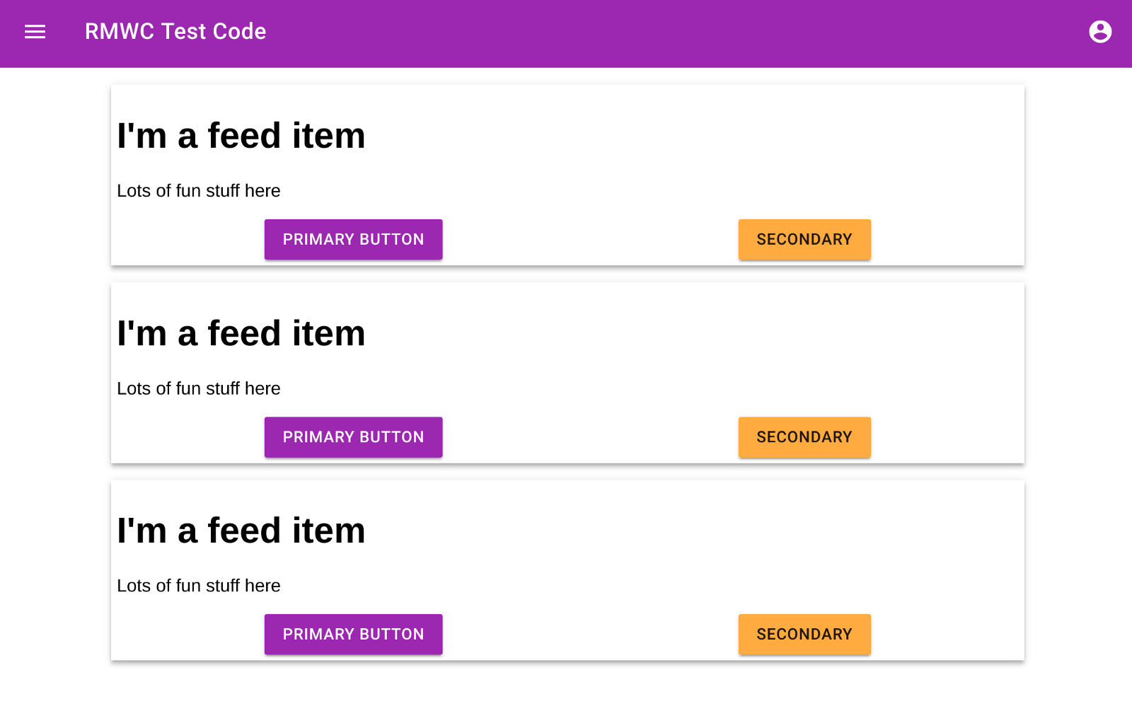
And in App.js lets go back to the feed_basic import, so we don’t override the theme using css variables. This is what you should get:

Now you have full access to building your own version of the material-web-components using the sass functionality that it was built with!

Source Code

You can find the final code at wschenk/rmwc-demo

Where does that leave us

Building off of the google work directly is pretty cool. There are a lot of other tools that are included that help make sense of what material design is, and what it can do for you. rmwc is really just a small wrapper around this stuff, bridging the gap between the pure javascript that comes from Material design with the React. SASS could be familiar to people, and it’s a really nice way to make CSS. React has a different style, which this is not, but it’s pretty smooth to integrate into the tool chain.

Here are a few awesome things that also come from the Material design mother ship:

Next time we’ll look at how to do the same thing with http://material-ui-next.com/

Previously

rmwc/rmwc

2017-11-29

Next

What Are the Most Effective Strategies for Learning a Foreign Language?: Six TED Talks Provide the Answers

2017-12-01

howto

Previously

Writing code on a chromebook a phone-like laptop

2017-11-15

Next

Styling and theming with material-ui: React + Material Design hrmph

2017-12-04