We’ve looked at building and styling with rmwc, now lets look a the king of the React Material libraries, Material-UI!
The implementation strategy here is different — instead of including a generated CSS file that applies to all of the elements, each component includes the CSS that it needs in an isolated way. import Button from ‘material-ui/Button’; will include all of the necessary CSS to render that element. This is done with webpack basically. If we want to style it in a special way, we’ll need to put style attributes on it directly or use another react-based way of doing this, keeping the styling, html, and JS tightly coupled. Which actually makes a lot of sense…
The basic way that material-ui does styling is with the withStyles higher order component. The complete system is explained in the documentation, but since I’m learning React as well I didn’t full understand how it worked at first. You can treat it as boilerplate code for now, but lets first get started rebuilding the same site as we did last time and seeing what looks like.
Create the app
First thing we do is to add material-ui@next and our favorite WebFont loader.
1
| $ yarn add material-ui@next material-ui-icons webfontloader
|
And then we load the Roboto font from the Google mothership. The Material Icons will come in as part of the npm package above.
 1
 2
 3
 4
 5
 6
 7
 8
 9
10
11
12
13
14
15
| import React from "react";
import ReactDOM from "react-dom";
import "./index.css";
import App from "./App";
import registerServiceWorker from "./registerServiceWorker";
import WebFont from "webfontloader";
WebFont.load({
google: {
families: ["Roboto:300,500,700"],
},
});
ReactDOM.render(<App />, document.getElementById("root"));
registerServiceWorker();
|
Now lets build out the nav bar component. This is going to look at lot more complicated than the rmwc version! On the other hand, absolutely everything you need to understand what is going to be displayed is self-contained in this file.
Lets walk through all the differences.
- The first thing you’ll notice is that each of the React components are in their own subpackage, which means that you’ll have a lot more import lines in your code
- The React Bits book is pretty awesome, and they have a section on using Higher Order Components for Styling, which is basically what we’re doing here.
withStyles is the higher order component that you use to merge in the styles. We create a function that accepts a theme object, and then we set our special CSS in there. At the bottom of the file we export default withStyles(styles)(Navbar) to expose our code to the rest of the app. What this does is merge our style overrides with the overall theme, and then lets us access the generated class name when we do the render.const {classes} = this.props is how we pull those classes out. They can then be referenced in our components using, for example, <IconButton className={classes.menuButton}/>. We start with our style definitions, which get passes a theme object, and it gets wrapped onto the properties of our component using withStyles. Clever, but not that simple.- I’m setting the
elevation={0} of AppBar to make it look the same as the other example. - Each of the MaterialIcons have their own component in the
material-ui-icons package.
Navbar.js:
 1
 2
 3
 4
 5
 6
 7
 8
 9
10
11
12
13
14
15
16
17
18
19
20
21
22
23
24
25
26
27
28
29
30
31
32
33
34
35
36
37
38
39
40
41
42
43
44
45
46
47
48
49
50
51
52
53
54
55
56
57
| import React, { Component } from "react";
import PropTypes from "prop-types";
import { withStyles } from "material-ui/styles";
import AppBar from "material-ui/AppBar";
import Toolbar from "material-ui/Toolbar";
import Typography from "material-ui/Typography";
import IconButton from "material-ui/IconButton";
import MenuIcon from "material-ui-icons/Menu";
import AccountCircle from "material-ui-icons/AccountCircle";
const styles = (theme) => ({
root: {
marginTop: theme.spacing.unit * 3,
width: "100%",
},
flex: {
flex: 1,
},
menuButton: {
marginLeft: -12,
marginRight: 20,
},
});
class Navbar extends Component {
render() {
const { classes } = this.props;
return (
<AppBar position="static" elevation={0}>
<Toolbar>
<IconButton
className={classes.menuButton}
color="contrast"
onClick={this.props.toggleDrawer}
>
<MenuIcon />
</IconButton>
<Typography className={classes.flex} type="title" color="inherit">
Material-UI Demo App
</Typography>
<div>
<IconButton color="contrast" onClick={this.props.login}>
<AccountCircle />
</IconButton>
</div>
</Toolbar>
</AppBar>
);
}
}
Navbar.propTypes = {
classes: PropTypes.object.isRequired,
};
export default withStyles(styles)(Navbar);
|
While material-ui doesn’t use the recompose library, I found reading through it’s docs very helpful in sorting out what withStyles actually is trying to accomplish.
Whew.
Lets do the login form now, and we’ll do something similar with a HOC. In this case we’ll use withMobileDialog which will pass in the fullscreen property as true to our component if the screen is small. For example, on a mobile device. In that case will we show a full screen window. This is your src/login.js
 1
 2
 3
 4
 5
 6
 7
 8
 9
10
11
12
13
14
15
16
17
18
19
20
21
22
23
24
25
26
27
28
29
30
31
32
33
34
35
36
37
38
39
40
41
42
43
44
45
46
47
48
| import React, { Component } from "react";
import Button from "material-ui/Button";
import TextField from "material-ui/TextField";
import Dialog, {
DialogActions,
DialogContent,
DialogContentText,
DialogTitle,
withMobileDialog,
} from "material-ui/Dialog";
class Login extends Component {
render() {
return (
<Dialog
open
onRequestClose={this.props.toggleLogin}
fullScreen={this.props.fullScreen}
>
<DialogTitle>Subscribe</DialogTitle>
<DialogContent>
<DialogContentText>
To subscribe to this website, please enter your email address here.
We will send updates occationally.
</DialogContentText>
<TextField
autoFocus
margin="dense"
id="name"
label="Email Address"
type="email"
fullWidth
/>
</DialogContent>
<DialogActions>
<Button onClick={this.props.toggleLogin} color="primary">
Cancel
</Button>
<Button onClick={this.props.toggleLogin} color="primary">
Subscribe
</Button>
</DialogActions>
</Dialog>
);
}
}
export default withMobileDialog()(Login);
|
Let us now recreate the drawer.js. (I’m using different Items in the drawer list since it’s just for example anyway, and this should give you a sense of how things are done.)
 1
 2
 3
 4
 5
 6
 7
 8
 9
10
11
12
13
14
15
16
17
18
19
20
21
22
23
24
25
26
27
28
29
30
31
32
33
34
35
36
37
38
39
40
41
42
| import React, { Component } from "react";
import Drawer from "material-ui/Drawer";
import List, { ListItem, ListItemIcon, ListItemText } from "material-ui/List";
import Divider from "material-ui/Divider";
import InboxIcon from "material-ui-icons/Inbox";
class MyDrawer extends Component {
render() {
return (
<Drawer
open={this.props.open}
onRequestClose={this.props.toggleDrawer}
type="persistent"
>
<div
tabIndex={0}
role="button"
onClick={this.toggleDrawer}
onKeyDown={this.toggleDrawer}
>
<List>
<ListItem button>
<ListItemIcon>
<InboxIcon />
</ListItemIcon>
<ListItemText primary="Inbox" />
</ListItem>
<Divider />
<ListItem button>
<ListItemIcon>
<InboxIcon />
</ListItemIcon>
<ListItemText primary="Something Else" />
</ListItem>
</List>
</div>
</Drawer>
);
}
}
export default MyDrawer;
|
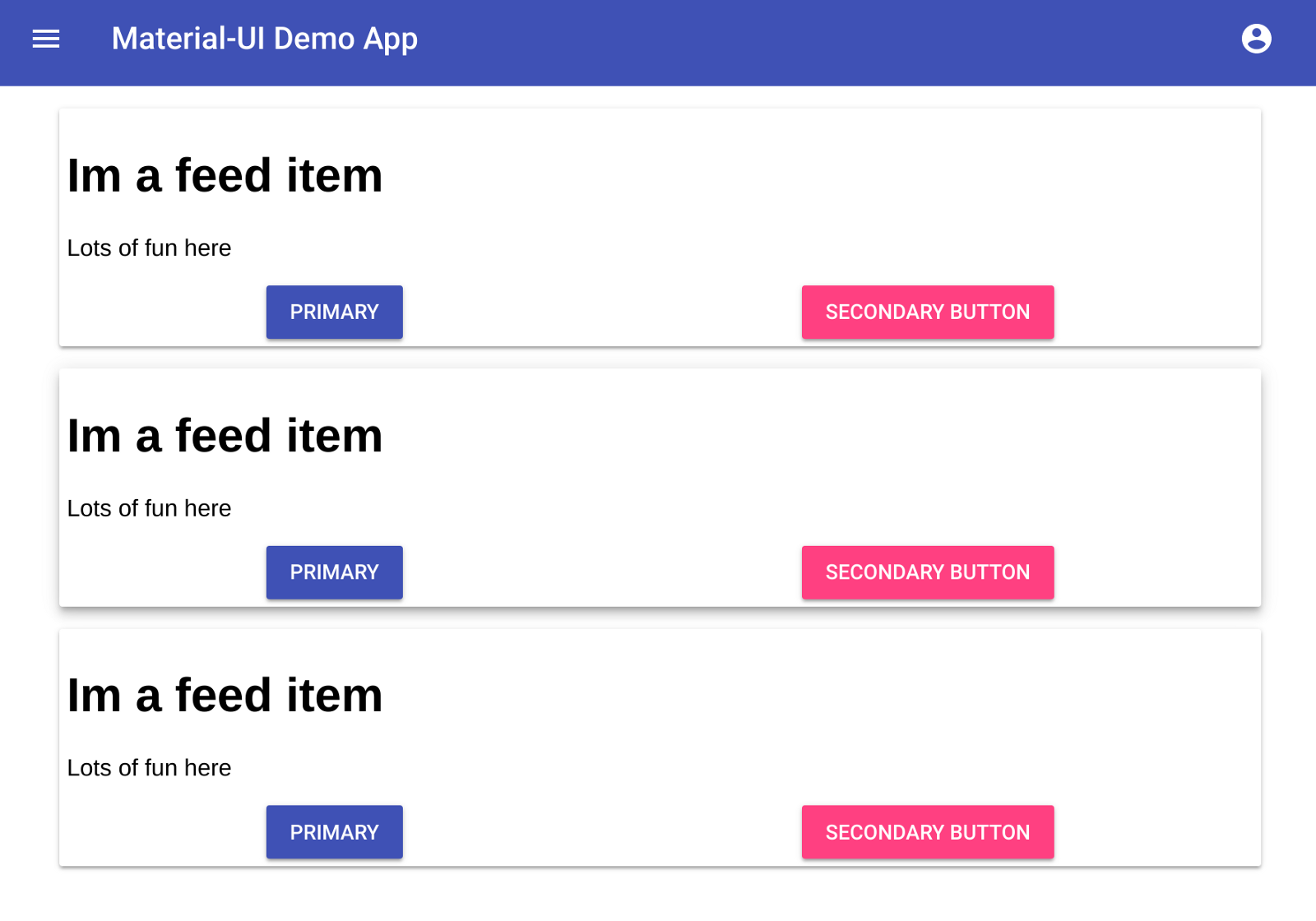
Now that we have the drawer in place, lets now build a simple little feed to start testing things on. I’m trying to recreate the same example that we did before, so I have two components defined in this class. This is for demo purposes only, and doesn’t really make sense.
- There’s some
css to get through in this class, but on the other hand, it’s all in the same place. For simple components or projects this is a pain. I think for larger projects that having these things isolated so that everything you need to understand about a specific component is in one place is better. This file should be split into at least 4 probably: feed.js, feed.css.js, feed_item.js, and feed_item.css.js. - I’m wrapping
FeedItem with withStyles here to make it more explicit what the withStyles does. Alteratively, we could pass in the class name on <FeedItem className={classes.feedItem}/> inside of FeedItem itself, but this makes it more explicit that you are only dealing with styled components. - Flexbox is pretty amazing once you get a hang of it.
 1
 2
 3
 4
 5
 6
 7
 8
 9
10
11
12
13
14
15
16
17
18
19
20
21
22
23
24
25
26
27
28
29
30
31
32
33
34
35
36
37
38
39
40
41
42
43
44
45
46
47
48
49
50
51
52
53
54
55
56
57
58
59
60
61
62
63
64
65
66
67
68
| import React, { Component } from "react";
import { withStyles } from "material-ui/styles";
import Paper from "material-ui/Paper";
import Button from "material-ui/Button";
const styles = (theme) => ({
feed: {
width: "100%",
display: "flex",
flexDirection: "column",
alignItems: "center",
},
feedItem: {
marginTop: "15px",
width: "100%",
padding: "5px",
maxWidth: "800px",
},
buttons: {
display: "flex",
alignItems: "center",
justifyContent: "space-around",
},
});
class FeedItem extends Component {
state = { elevation: 2 };
render() {
const { classes } = this.props;
return (
<Paper
className={classes.feedItem}
elevation={this.state.elevation}
onMouseOver={() => this.setState({ elevation: 6 })}
onMouseOut={() => this.setState({ elevation: 2 })}
>
<h1>Im a feed item</h1>
<p>Lots of fun here</p>
<div className={classes.buttons}>
<Button raised color="primary" onClick={this.props.onClick}>
Primary
</Button>
<Button raised color="accent" onClick={this.props.onClick}>
Secondary Button
</Button>
</div>
</Paper>
);
}
}
const StyledFeedItem = withStyles(styles)(FeedItem);
class Feed extends Component {
render() {
const { classes } = this.props;
return (
<div className={classes.feed}>
<StyledFeedItem onClick={() => this.props.setTheme(0)} />
<StyledFeedItem onClick={() => this.props.setTheme(1)} />
<StyledFeedItem onClick={() => this.props.setTheme(2)} />
</div>
);
}
}
export default withStyles(styles)(Feed);
|
And finally, lets update the App.js to wrap it all together.
 1
 2
 3
 4
 5
 6
 7
 8
 9
10
11
12
13
14
15
16
17
18
19
20
21
22
23
24
25
26
27
28
29
30
31
32
33
34
35
36
37
38
39
40
41
42
43
44
45
46
47
48
49
50
51
| import React, { Component } from "react";
import { withStyles } from "material-ui/styles";
import Drawer from "./drawer";
import Navbar from "./navbar";
import Login from "./login";
import Feed from "./feed_basic";
const drawerWidth = 216;
const styles = (theme) => ({
narrowContainer: {
width: `calc(100% - ${drawerWidth}px)`,
marginLeft: `${drawerWidth}px`,
transition: theme.transitions.create(["margin", "width"], {
easing: theme.transitions.easing.easeOut,
duration: theme.transitions.duration.enteringScreen,
}),
},
});
class App extends Component {
state = { drawer: false, login: false };
toggleDrawer = () => {
this.setState({ ...this.state, drawer: !this.state.drawer });
};
toggleLogin = () => {
this.setState({ ...this.state, login: !this.state.login });
};
render() {
const { classes } = this.props;
return (
<div>
{this.state.login && <Login toggleLogin={this.toggleLogin} />}
<Drawer open={this.state.drawer} toggleDrawer={this.toggleDrawer} />
<div className={this.state.drawer ? classes.narrowContainer : null}>
<Navbar
open={this.state.drawer}
toggleDrawer={this.toggleDrawer}
login={this.toggleLogin}
/>
<Feed />
</div>
</div>
);
}
}
export default withStyles(styles)(App);
|
- One thing is strange with this is that I’m handling the opening/closing CSS logic inside of the main container. If I wasn’t trying to follow the same structure as the last example, I would split this out into a Sidebar/Main component that figured out the CSS logic so it wouldn’t polute this page.
calc(100% — ${drawerWidth}px) is pretty amazing
And this should look familiar!
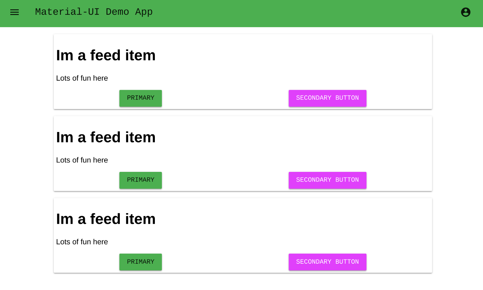
Changing theme level properties
Themes in material-ui are top level objects that get set using the MuiThemeProvider component. This, in turn, will do some magic with the React context and the theme object will get passed into the function that you provided to withStyles. Lets have an example to see what I mean.
- I’ve defined 3 different themes. One default, one with basic colors, and one with different fonts.
- There’s a lot more to wrap your head around to make this work initially, but it feels cleaner and more direct.
 1
 2
 3
 4
 5
 6
 7
 8
 9
10
11
12
13
14
15
16
17
18
19
20
21
22
23
24
25
26
27
28
29
30
31
32
33
34
35
36
37
38
39
40
41
42
43
44
45
46
47
48
49
50
51
52
53
54
55
56
57
58
59
60
61
62
63
64
65
66
67
68
69
70
71
72
73
74
75
76
77
78
79
| import React, { Component } from "react";
import { MuiThemeProvider, createMuiTheme } from "material-ui/styles";
import { withStyles } from "material-ui/styles";
import Drawer from "./drawer";
import Navbar from "./navbar";
import Login from "./login";
import Feed from "./feed_basic";
import purple from "material-ui/colors/purple";
import green from "material-ui/colors/green";
const defaultTheme = createMuiTheme();
const purpleTheme = createMuiTheme({
palette: {
primary: purple,
secondary: green,
},
});
const fontTheme = createMuiTheme({
palette: {
secondary: purple,
primary: green,
},
typography: {
fontFamily: ["Courier", "Helvetica"],
},
});
const themes = [defaultTheme, purpleTheme, fontTheme];
const drawerWidth = 216;
const styles = (theme) => ({
narrowContainer: {
width: `calc(100% - ${drawerWidth}px)`,
marginLeft: `${drawerWidth}px`,
transition: theme.transitions.create(["margin", "width"], {
easing: theme.transitions.easing.easeOut,
duration: theme.transitions.duration.enteringScreen,
}),
},
});
class App extends Component {
state = { drawer: false, login: false, theme: defaultTheme };
toggleDrawer = () => {
this.setState({ ...this.state, drawer: !this.state.drawer });
};
toggleLogin = () => {
this.setState({ ...this.state, login: !this.state.login });
};
setTheme = (idx) => {
this.setState({ ...this.state, theme: themes[idx] });
};
render() {
const { classes } = this.props;
return (
<MuiThemeProvider theme={this.state.theme}>
{this.state.login && <Login toggleLogin={this.toggleLogin} />}
<Drawer open={this.state.drawer} toggleDrawer={this.toggleDrawer} />
<div className={this.state.drawer ? classes.narrowContainer : null}>
<Navbar
open={this.state.drawer}
toggleDrawer={this.toggleDrawer}
login={this.toggleLogin}
/>
<Feed setTheme={this.setTheme} />
</div>
</MuiThemeProvider>
);
}
}
export default withStyles(styles)(App);
|
Conclusion
The biggest take away from doing this various different ways is that the first three or four times I use a library I don’t have a great idea of how it works. So it’s important to keep going over the same thing again and again, starting from scratch once you figure something new out and reorganizing based upon what you’ve learned. Much like learning how to play an instrument, going back and repeating each section to learn it better makes the final performance that much easier.
Material-UI has a lot more activity on the project than rmwc does. It’s using a different version of material design, and we aren’t using the library that Google provided directly. Some of the tools that Google provides can’t be effectively leveraged. But if you are building in React, which we are, MaterialUI seems like a much more effective and powerful choice.
Final code can be found here: https://github.com/wschenk/material-ui-demo