We are going to use tailwindcss to build a site. We will start with a blank folder and a static HTML file to work on the designs, and then slowly bring in other tools when needed to add in functionality.
The site that we are going to build is a company directory that pulls in data from Google Apps Suite. The goal here is to build the simplest thing possible and not get lost in the tooling. We will start with a static site and explore different ways to pull in the data and style it.
- First go through styling a page with tailwind
- Then we’ll introduce the
template tag to style repeated elements - Then we’ll build a Single Page App within a single HTML file with no tooling.
Create the project folder and base HTML file
1
| mkdir projectname && cd projectname
|
Now we will create a base html file that we’ll use to start styling. We are going to include the full tailwind.min.css file from a CDN so there’s no build process here.
 1
 2
 3
 4
 5
 6
 7
 8
 9
10
11
12
13
| <html lang="en">
<head>
<meta charset="UTF-8">
<meta name="viewport" content="width=device-width, initial-scale=1.0">
<meta http-equiv="X-UA-Compatible" content="ie=edge">
<title>This is my title</title>
<link href="https://unpkg.com/tailwindcss@^1.0/dist/tailwind.min.css" rel="stylesheet">
</head>
<body>
<h1>This is my document</h1>
<p>There are many like it, but this one is mine.</p>
</body>
</html>
|
Let’s start up a preview server by running npx live-server which should open up a browser window which will update files. You should see a window open up. If you edit some of the text, you should see it updated in the browser once you save. So far so good. All we’ve needed is an html file and node installed on the machine.
The profile page
I pulled in my company logo and a headshot (well, I needed a passport photo for a visa application and so I went to a photobooth and took a picture of that photo with my phone, so it’s like a manual Instagram filter) from our website, and wrote up a silly bio. Let’s throw that on a page a start adding classes.
Lets build this:

 1
 2
 3
 4
 5
 6
 7
 8
 9
10
11
12
13
14
15
16
17
18
19
20
21
22
23
24
25
26
27
28
29
30
| <html lang="en">
<head>
<meta charset="UTF-8">
<meta name="viewport" content="width=device-width, initial-scale=1.0">
<meta http-equiv="X-UA-Compatible" content="ie=edge">
<title>Will Schenk</title>
<link href="https://unpkg.com/tailwindcss@^1.0/dist/tailwind.min.css" rel="stylesheet">
</head>
<body>
<div>
<img src="logo.svg">
</div>
<img src="face.jpg">
<div>
<h1>Will Schenk</h1>
<h2>COO, CoFounder</h2>
<p>
Will focuses on overall internal management of HappyFunCorp,
which involves making sure that people are happy and productive,
that clients are happy with their projects. This involves
meetings and a lot of psycology. It's rewarding when
the company is growing and thriving, but also very different
from time spent immersed in the fun of computers.
The career grew out of the hobby, and now that my daily job
is different from the hobby I can go back to being a
hobby programmer. Coding for the pleasure of it.
</p>
</div>
</body>
</html>
|
There are two sections here, one for the header and the other for the bio. Let’s open up the Tailwind Documentation and walk through the process of styling everything. The workflow here is to press the / key and type in what we are looking for to find the classes that we’ll need to apply it.
Colors
First, let’s tweak some overall colors. We can search for “background” to see the classes available, so let’s add a few. Change the body background, maybe the text color, and the background color of the header.
1
2
3
| <body class="bg-gray-100 text-faded-800">
<div class="bg-blue-500"></div>
</body>
|
Margins and Padding
Next, let’s center the things in the header by added auto margins to both of the img tags. If we search for margin we’ll see tons of utility classes, and we can find horizontal auto margins under mx-auto.
1
2
3
4
| <div class="bg-blue-500">
<img src="logo.svg" class="mx-auto" />
</div>
<img src="face.jpg" class="mx-auto" />
|
Let’s fix some sizing and shaping here. Searching for height or width we can add some classes to logo.svg say h-10 w-auto to make it 2.5rem big. We will also make the image h-32 and w-32 to shrink it down and bit. Also search for round to find the rounded-full class to make the avatar rounded.
1
2
3
4
| <div class="bg-blue-500">
<img src="logo.svg" class="mx-auto h-10 w-auto" />
</div>
<img src="face.jpg" class="mx-auto h-32 w-32 rounded-full" />
|
Finally we need to give this thing more breathing room. Let’s add some padding to the top container, and then some negative top margin on the avatar to slide it up. Since the avatar is size 32, we’ll add negative 16 top margin to it. Sticking with this sizing, we’ll add top 16 margin to the header div, and space it out sized 4 from the logo for 16+4 bottom margin
1
2
3
4
| <div class="bg-blue-500 pt-16 pb-20">
<img src="logo.svg" class="mx-auto h-10 w-auto" />
</div>
<img src="face.jpg" class="mx-auto rounded-full h-32 w-32 -mt-16" />
|
Popping
The avatar looks pretty bland now, so let’s search for borders and shadows. Add shadow-xl border-solid border-2 border-gray-300 to the avatar img to give it a little border and a box shadow, and maybe we can also add a little shadow to the colored box.
1
2
3
4
5
6
7
| <div class="bg-blue-500 pt-16 pb-20 shadow-lg">
<img src="logo.svg" class="mx-auto h-10 w-auto" />
</div>
<img
src="face.jpg"
class="mx-auto rounded-full h-32 w-32 -mt-16 shadow-xl border-solid border-2 border-gray-300"
/>
|
Typography
We can center the text by adding mx-auto to the outer div, and text-center to both the h1 and h2 tags. We’ll also set a max-w-lg to keep the text in a smaller area.
1
2
3
4
| <div class="mx-auto max-w-lg">
<h1 class="text-center">Will Schenk</h1>
<h2 class="text-center">COO, CoFounder</h2>
</div>
|
We can adjust the text size by adding text-4xl and text-xl to the headers.
1
2
| <h1 class="text-center text-4xl">Will Schenk</h1>
<h2 class="text-center text-cl">COO, CoFounder</h2>
|
We’ll change the font weight using font-semibold and font-light, and decrease the letterspacing (aka tracking) to tracking-tight
1
2
| <h1 class="text-center text-4xl font-semibold tracking-tight">Will Schenk</h1>
<h2 class="text-center text-cl font-light">COO, CoFounder</h2>
|
Finally, the vertical spacing doesn’t feel great, so let’s add some padding at the top and bottom.
1
2
3
4
| <h1 class="pt-4 text-center text-4xl font-semibold tracking-tight">
Will Schenk
</h1>
<h2 class="pb-4 text-center text-cl font-light">COO, CoFounder</h2>
|
Finally, we can open the spacing up a bit on the bio text by changing the line spacing, called leading in typography lingo, and justifying the text.
1
| <p class="leading-relaxed text-justify"></p>
|
For everything is
static/profile.html:
 1
 2
 3
 4
 5
 6
 7
 8
 9
10
11
12
13
14
15
16
17
18
19
20
21
22
23
| --- profile.html.base
+++ profile.html
@@ -8,11 +8,12 @@
</head>
- <body>
- <div>
- <img src="logo.svg">
+ <body class="bg-gray-100 text-gray-800">
+ <div class="bg-blue-500 pt-16 pb-20 shadow-lg">
+ <img src="logo.svg" class="mx-auto h-10 w-auto">
</div>
- <img src="face.jpg">
- <div>
- <h1>Will Schenk</h1>
- <h2>COO, CoFounder</h2>
- <p>
+ <img src="face.jpg" class="mx-auto h-32 w-32 rounded-full -mt-16 shadow-xl border-solid border-2 border-gray-300">
+ <div class="mx-auto max-w-lg">
+ <h1 class="pt-4 text-center text-4xl font-semibold tracking-tight">Will Schenk</h1>
+ <h2 class="pb-4 text-center text-xl font-light">COO, CoFounder</h2>
+ <p class="leading-relaxed text-justify">
+
Will focuses on overall internal management of HappyFunCorp,
|
Directory pages
For our directory pages, we know that we are going to repeat the same element multiple times. We’ll use the html template tag to let us edit stuff in place. We’ll define the template, a div to hold it in, and some short javascript to add 10 copies of it to the container.
 1
 2
 3
 4
 5
 6
 7
 8
 9
10
11
12
13
14
15
16
17
18
19
20
21
22
23
24
25
26
27
28
29
30
31
32
33
34
| <html lang="en">
<head>
<meta charset="UTF-8">
<meta name="viewport" content="width=device-width, initial-scale=1.0">
<meta http-equiv="X-UA-Compatible" content="ie=edge">
<title>Directory</title>
<link href="https://unpkg.com/tailwindcss@^1.0/dist/tailwind.min.css" rel="stylesheet">
</head>
<body>
<div class="bg-blue-500 pt-16 pb-20 shadow-lg">
<img src="logo.svg" class="mx-auto h-10 w-auto">
</div>
<div id="container">
</div>
<template id="person">
<div>
<img src="face.jpg">
<h1>Will Schenk</h1>
<h2>COO, CoFounder</h2>
<a href="mailto:will@happyfuncorp.com">will</a>
</div>
</template>
<script>
var container = document.querySelector( '#container' );
var template = document.querySelector( '#person' );
for( var i = 0; i < 10; i++ ) {
container.appendChild( template.content.cloneNode(true) );
}
</script>
</body>
</html>
|
Now let’s get a better layout, using flexbox to lay it out. Add flex to the container div and we see that everything is laid out horizontally. This is a bit intense since everything is on one row. Let’s add flex-wrap and justify-around to it also, to have it span multiple lines and equally spread out the space around each element.
1
| <div id="container" class="flex flex-wrap justify-around"></div>
|
Much better. The image I’m using is huge, so let’s shrink down that img class so we can see what we are looking at. Let’s also copy the rounded and popping ideas from before.
1
2
3
4
| <img
src="face.jpg"
class="h-32 w-32 shadow-xl border-2 border-gray-200 rounded-full"
/>
|
Let’s now fix the size of the cards themselves. We’ve seen all these classes before, but I’m going to make it w-64 and add a rounded border to it.
1
| <div class="w-64 border-solid border border-gray-200 rounded-lg"></div>
|
I want to center the image and have it overlap the card. We’ll do this by adding mt-20 to the outer div, and -mt-16 ml-16 to the image.
1
2
3
4
5
6
| <div class="w-64 mt-20 border-solid border border-gray-200 rounded-lg">
<img
src="face.jpg"
class="h-32 w-32 -mt-16 ml-16 shadow-xl border-2 border-gray-200 rounded-full"
/>
</div>
|
Finally we’ll just center the email address.
1
2
3
| <a class="text-center block mt-2 font-light" href="mailto:will@happyfuncorp.com"
>will</a
>
|
Variable templating
Before we go down the route of setting up webcomponents and pulling in a bunch of other files, let’s change the code so that instead of duplicating the same template element each time, we drive it from an array.
static/directory.html:
 1
 2
 3
 4
 5
 6
 7
 8
 9
10
11
12
13
14
15
16
17
18
19
20
21
22
23
| --- directory.html.1
+++ directory.html
@@ -28,4 +28,18 @@
- for( var i = 0; i < 10; i++ ) {
- container.appendChild( template.content.cloneNode(true) );
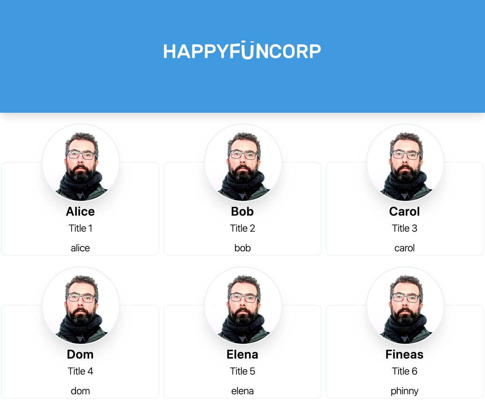
+ var people = [
+ { name: 'Alice', title: 'Title 1', mail: 'alice' },
+ { name: 'Bob', title: 'Title 2', mail: 'bob' },
+ { name: 'Carol', title: 'Title 3', mail: 'carol' },
+ { name: 'Dom', title: 'Title 4', mail: 'dom' },
+ { name: 'Elena', title: 'Title 5', mail: 'elena' },
+ { name: 'Fineas', title: 'Title 6', mail: 'phinny' },
+ ];
+
+ for( var i = 0; i < people.length; i++ ) {
+ var tmp = template.content.cloneNode(true);
+ tmp.querySelector("h1").innerText = people[i].name;
+ tmp.querySelector("h2").innerText = people[i].title;
+ tmp.querySelector("a").innerText = people[i].mail;
+ tmp.querySelector("a").href = "mailto:" + people[i].mail + "@happyfuncorp.com";
+ container.appendChild( tmp );
}
|
This looks like it will get out of hand a bit as we add more, say a tags, but it’s a simple way to get going.
Adding more pages
Now we can add different pages to the site. We’ll start with a boiler plate that contains all of our previous code in a template. On the top we have the header, and a simple sidebar that we’ll wire up to view things on the page.
 1
 2
 3
 4
 5
 6
 7
 8
 9
10
11
12
13
14
15
16
17
18
19
20
| <body class="bg-gray-100 text-faded-900">
<div class="bg-blue-500 pt-16 pb-20 shadow-lg">
<img src="logo.svg" class="mx-auto h-10 w-auto" />
</div>
<div class="flex">
<div class="w-64 p-4">
<a href="#" class="block">Login</a>
<a href="#" class="block pt-4">Directory</a>
<a href="#" class="block pt-4">Profile</a>
</div>
<div id="root" class="w-full"></div>
</div>
<template id="login">
<button class="m-4 px-4 py-2 bg-blue-500 text-faded-100 rounded">
Login
</button>
</template>
</body>
|
If you want to see the starting code, it’s static/index.html.base. Let’s get into the JavaScript!
First we are going to add some click handlers to our sidebar, using good old onClick.
Then we have three functions that clear out the root dom element, pull the content from the template tags, adjust as needed and add to the root container.
static/index.html:
 1
 2
 3
 4
 5
 6
 7
 8
 9
10
11
12
13
14
15
16
17
18
19
20
21
22
23
24
25
26
27
28
29
30
31
32
33
34
35
36
37
38
39
40
41
42
43
44
45
46
47
48
49
50
51
52
53
54
55
56
57
| --- index.html.base
+++ index.html
@@ -15,5 +15,5 @@
<div class="w-64 p-4">
- <a href="#" class="block">Login</a>
- <a href="#" class="block pt-4">Directory</a>
- <a href="#" class="block pt-4">Profile</a>
+ <a href="#" onClick="showLogin()" class="block">Login</a>
+ <a href="#" onClick="showDirectory()" class="block pt-4">Directory</a>
+ <a href="#" onClick="showProfile()" class="block pt-4">Profile</a>
</div>
@@ -55,2 +55,45 @@
</template>
+ <script>
+ var root = document.querySelector( '#root' );
+ var loginTemplate = document.querySelector( '#login' );
+ var personTemplate = document.querySelector( '#person' );
+ var profileTemplate = document.querySelector( '#profile' );
+
+ function showLogin() {
+ root.innerHTML = '';
+ root.appendChild( loginTemplate.content.cloneNode(true));
+ }
+
+ function showDirectory() {
+ // This is a bit hacky
+ root.innerHTML = '<div id="container" class="flex flex-wrap justify-around"></div>';
+ var container = document.querySelector( "#container" );
+
+ var people = [
+ { name: 'Alice', title: 'Title 1', mail: 'alice' },
+ { name: 'Bob', title: 'Title 2', mail: 'bob' },
+ { name: 'Carol', title: 'Title 3', mail: 'carol' },
+ { name: 'Dom', title: 'Title 4', mail: 'dom' },
+ { name: 'Elena', title: 'Title 5', mail: 'elena' },
+ { name: 'Fineas', title: 'Title 6', mail: 'phinny' },
+ ];
+
+ people.forEach( (person) => {
+ var tmp = personTemplate.content.cloneNode(true);
+ tmp.querySelector("h1").innerText = person.name;
+ tmp.querySelector("h2").innerText = person.title;
+ tmp.querySelector("a").innerText = person.mail;
+ tmp.querySelector("a").href = "mailto:" + person.mail + "@happyfuncorp.com";
+ container.appendChild( tmp );
+ } )
+ }
+
+ function showProfile() {
+ root.innerHTML = '';
+ root.appendChild( profileTemplate.content.cloneNode(true) );
+ }
+
+ showLogin();
+ </script>
+
</body>
|
Conclusion
From here the next step in organization would be to split these templates out into their own webcomponents. We’ll be building more once we get data from an external source, and that will make the organization complicated. But for now, this works for demoable purposes and all we’ve had to use to make this all happen in a code editor. No tooling, compiling, and all of the code is self-contained and ready for someone to start hacking away at it.
The design and design implementation process with tailwind should also be called out for being such a pleasure. Editing one file, our choices contrained by what’s available so we don’t get too crazy – I especially like that padding and margins aren’t pixel based, so you get to be forced between a couple options and one is generally better than the other. You feel guided but someone else’s experience.
I also really like that the HTML and the styling are together so you aren’t flipping between two different mindsets. That makes it possible to resist the over generalization temptation of CSS to try and build reusable components, which you always end up needing to tweak in any case. Sure you have to do things multiple times, but since it’s so easy to do it you come out way ahead with the added simplicity and lower cognitive surface area. Would recommend.
References
- https://tailwindcss.com/
- https://developer.mozilla.org/en-US/docs/Web/HTML/Element/template