howto

Building a site with nuejs

not quite static, but very small

tags
nuejs

nuejs is a modern way to build content sites that uses modern browser features to make everything much simplier and cleaner than something like astro or vite. It's still early, but its fun to play around with.

It's got strong feelings about its global design system, standardizing the page layout, how to use css, and a nifty bit of markdown extension which makes it easier to focus on the content of the site.

I like the simplicity, lets see what we can do.

Install bun

1
2
  asdf plugin add bun
  asdf install bun latest

Create the project in a temp directory:

1
2
  cd $(mktemp -d)
  pnpx nuekit create

site.yaml

 1
 2
 3
 4
 5
 6
 7
 8
 9
10
11
12
13
14
  globals: ["@global"]
  libs: ["@library"]

  title: "Monkey Thumb"
  port: 8083

  header:
    navigation:
      - Monkey Thumb: /
      - About: /about

  footer:
    copyright:
      - © Monkey Thumb: /

index.md

1
2
3
4
5
6
7
8
9
  # What happened when monkeys got thumbs?

  Practical AI tools to solve real world tasks.

  =====

  ## Check it out

  This is an example of all my awesome stuff.

Start the server

1
  npx nuekit

and you can see that it prints out some nice semantic html

1
curl http://localhost:8083 | htmlq -p
<html dir="ltr" lang="en-US">
  <head>
    <meta charset="utf-8">
    
    <title>
      What happened when monkeys got thumbs?
    </title>
    <meta content="2024-08-20T18:04:04.543Z" name="date.updated">
    
    <meta content="width=device-width,initial-scale=1" name="viewport">
    
    <meta content=" " name="nue:components">
    
    <link href="/@global/layout.css" rel="stylesheet">
    
    <link href="/@global/typography.css" rel="stylesheet">
    
    <script src="/@nue/hotreload.js" type="module"></script>
  </head>
  <body>
    <header>
      <nav aria-label="navigation">
        <a href="/">
          Monkey Thumb</a><a href="/about">About</a>
      </nav>
    </header>
    <main>
      <article>
        <section>
          <h1>
            What happened when monkeys got thumbs?
          </h1>
          <p>
            Practical AI tools to solve real world tasks.
          </p>
        </section>
        <section>
          <h2 id="check-it-out">
            <a href="#check-it-out" title="Check it out"></a>Check it out
          </h2>
          <p>
            This is an example of all my awesome stuff.
          </p>
        </section>
      </article>
    </main>
    <footer>
      <nav aria-label="copyright">
        <a href="/">
          © Monkey Thumb</a>
      </nav>
    </footer>
  </body>
</html>

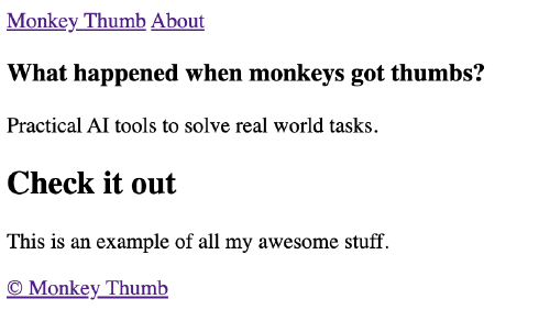
Which looks like:
Adding global styles

Adding in styles is as easy as putting css into the @global directory (which was specified in site.yaml)

1
  mkdir -p @global

Here is the main layout section.

 1
 2
 3
 4
 5
 6
 7
 8
 9
10
11
12
13
14
15
16
17
18
19
20
21
22
23
24
25
26
27
28
29
30
31
32
33
34
35
36
37
38
  /* @global/layout.css */
  /* all reset/normalization you need */
  ,*,
  ,*::before,
  ,*::after {
      box-sizing: border-box;
  }

  /* page layout */
  body {
      max-width: 1000px;
      margin: 0 auto;
      padding: 2% 5%;
  }

  header nav, footer nav {
      display: flex;
      justify-content: space-between;
      
      a {
          text-decoration: none;
          font-weight: 600;
          color: var(--gray-900);
      }
      
      a:hover {
          background: var(--gray-300);
          transition: background-color 1s;
      }
  }

  header nav {
      margin-bottom: 4rem;
  }

  footer nav {
      margin-top: 4rem;
  }

And here we can add some typography.

 1
 2
 3
 4
 5
 6
 7
 8
 9
10
11
12
13
  /* @global/typography.css */
  body {
      /* https://github.com/system-fonts/modern-font-stacks#neo-grotesque */
      font-family: Inter, Roboto, 'Helvetica Neue', 'Arial Nova', 'Nimbus Sans', Arial, sans-serif;
  }

  h1 {
      font-size: 2em;
  }

  h2 {
      font-size: 1.5em;
  }
 1
 2
 3
 4
 5
 6
 7
 8
 9
10
11
12
13
14
15
16
  /* @global/colors.css */

  :root {

  /* slate gray */
  --gray-100: #f3f4f6;
  --gray-200: #e5e7eb;
  --gray-300: #d1d5db;
  --gray-500: #6b7280;
  --gray-800: #1f2937;
  --gray-900: #111827;

  /* main color */
  --main-500: #3b82f6;
  --main-600: #2563eb;
  }

Adding in a library

Lets add motion to our main page. First we need to tell it to import that library:

 1
 2
 3
 4
 5
 6
 7
 8
 9
10
11
12
13
  ---
  include: [hero, motion]
  ---

  # What happened when monkeys got thumbs?

  Practical AI tools to solve real world tasks.

  =====

  ## Check it out

  This is an example of all my awesome stuff.

And then lets put in some motion stuff in @library/motion.css

1
  mkdir -p @library
1
2
3
4
5
6
7
  /* @library/hero */
  section:first-child {
      max-width: 650px;
      margin: 4rem auto;
      text-align: center;

  }
 1
 2
 3
 4
 5
 6
 7
 8
 9
10
11
12
13
14
15
16
17
18
/* motion setup */
h1,
h1 + p,
h1 + p + * {
  transition: opacity 0.5s, filter 0.7s;
  filter: none;
  opacity: 1;

  @starting-style {
    filter: blur(10px);
    opacity: 0;
  }
}

/* apply motion in sequence */
h1 {
  transition-delay: 0.1s;
}

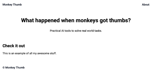
Which gives us

Just a start

There's a lot more to the framework, but the stripped down css and having nav layout built in is very compelling.

Previously

howto

LLM Tool calls

getting it to talk back

tags
ollama
ai
vercel

Next

labnotes

Playing with streamlit

visualizing your data

tags
streamlit